How To Use 360 Degree Rotation View Widget on your Elementor site.
If you are running an E-Commerce site then you might be needed to show your product at each angle. Basically it helps the visitors to know much better about your product. Now you can create your 360 degrees rotated image for your website with the BestWpDeveloper Elementor widget.
So, let’s get started:
Step One:
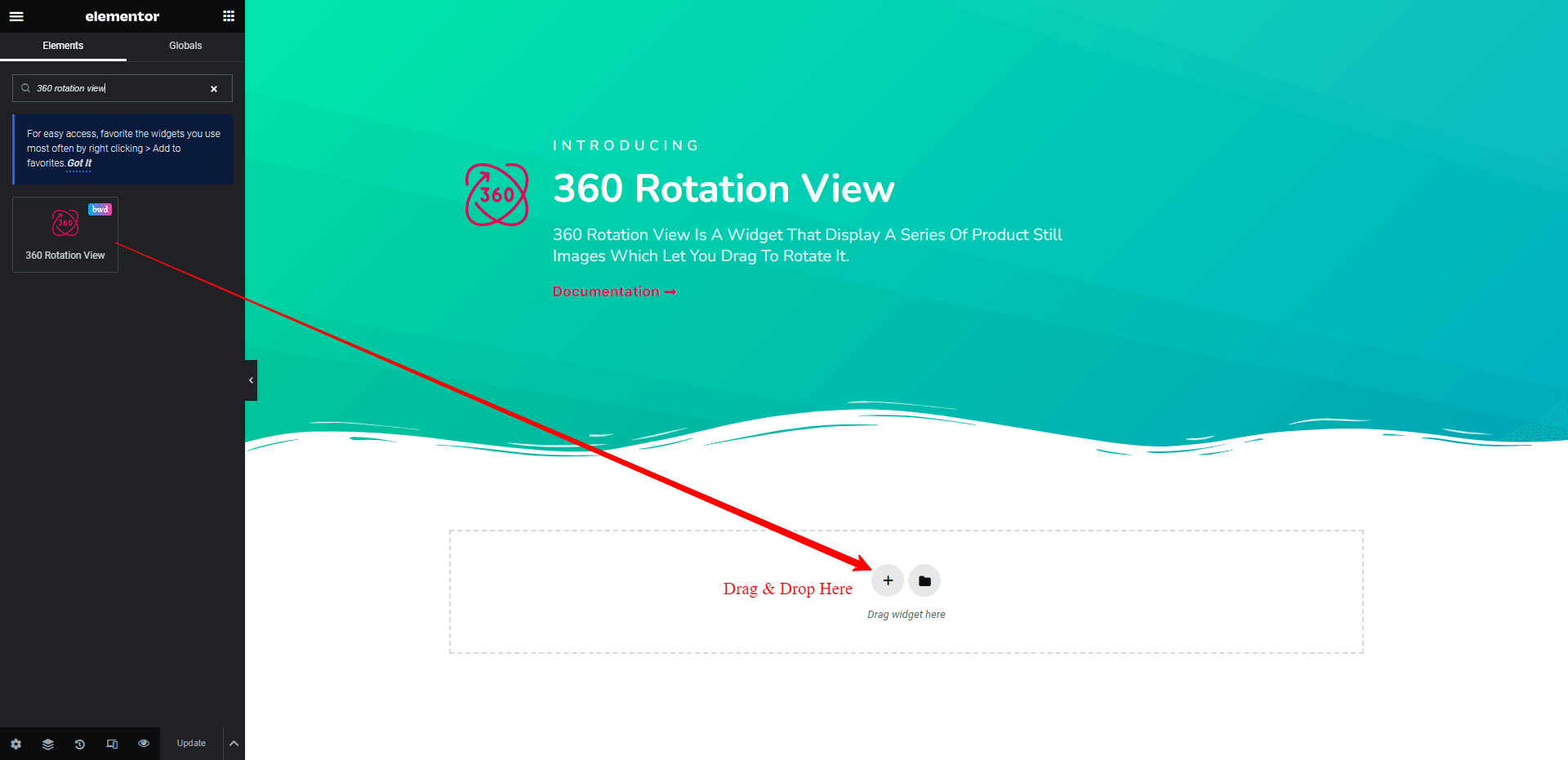
First, add the widget from the left sidebar of your Elementor page screen. Just select the widget and drag it to the marked area.
Step Two:
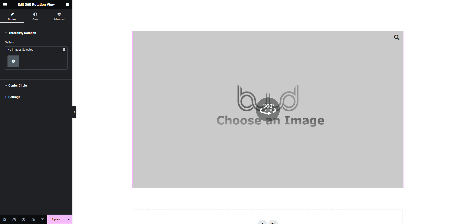
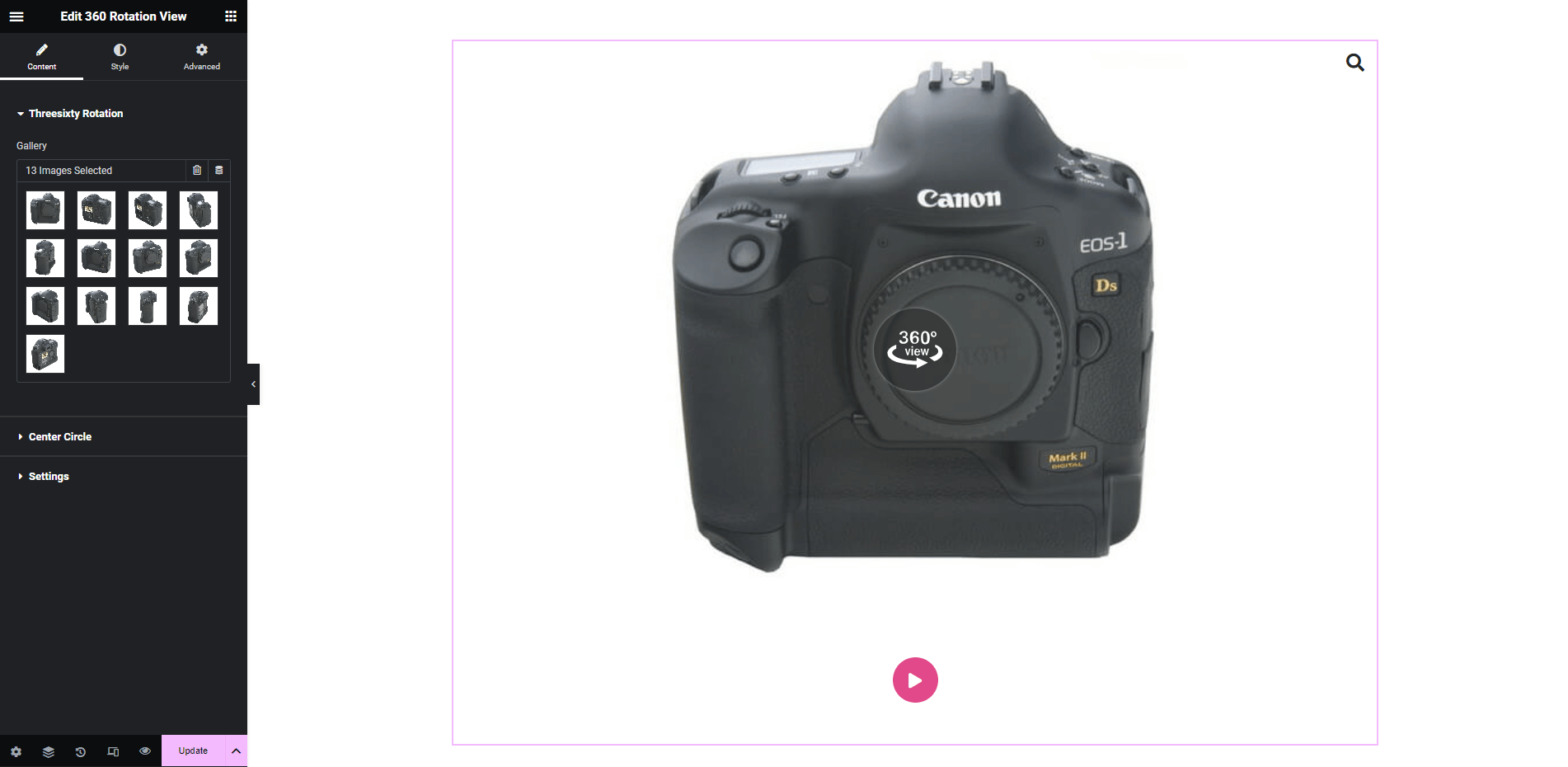
After dragging the widget you will get this interface,
Create Media Gallery:
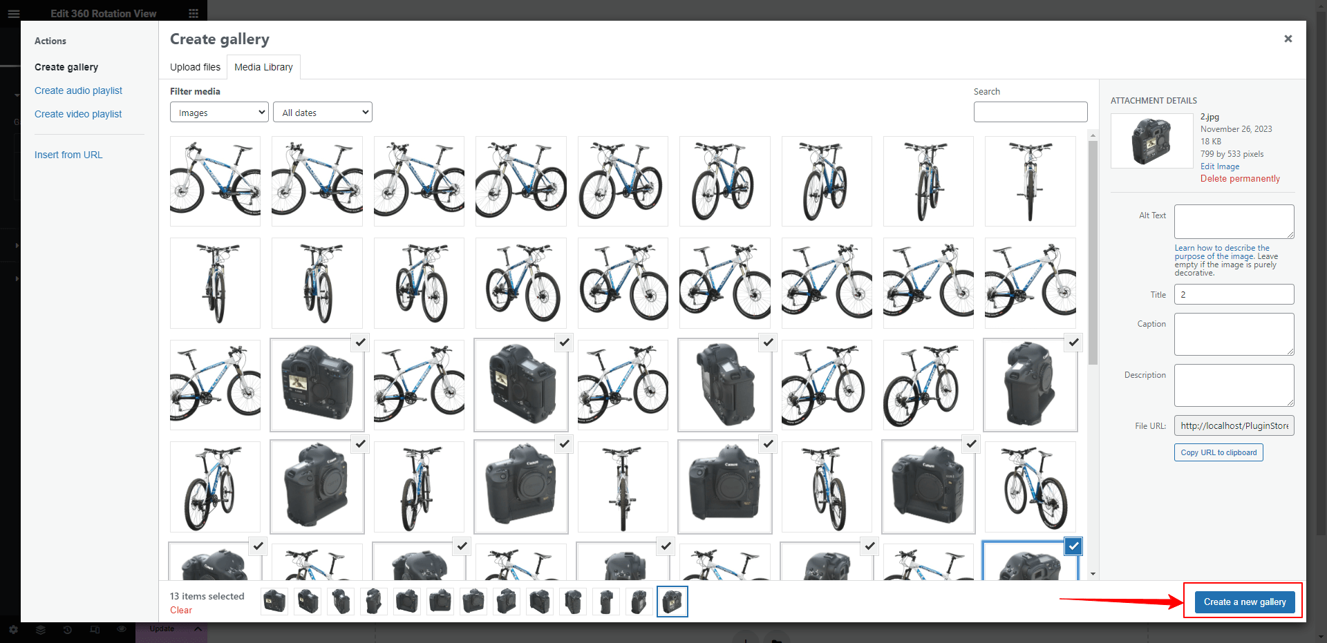
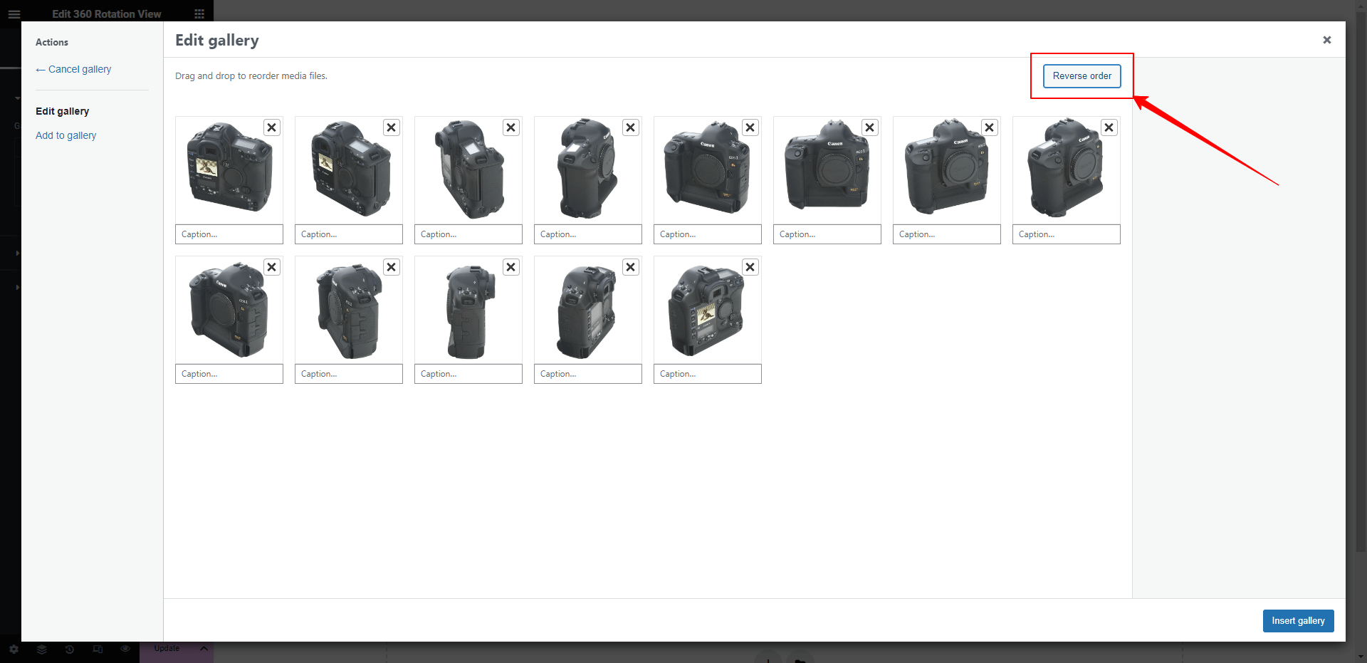
You will get a gallery option on the left sidebar of your editing panel. From there you have to click on the plus button to insert images. After that, you need to upload your product images. You can add several images at a time. You need to select all the images and create a media gallery. The will be available on the bottom-right side of the window.
After creating a media gallery you can remove any image if you want. There is another option. You can rotate all the images within a single click by using the Rotate button.
Then click the Insert gallery button to insert all of the images. After inserting all the images you will get this view,
Note: If you want to make your rotated image elegant, then you need to upload all the images in the same size. And you need to upload all images sequentially. It will help to rotate the product seamlessly.
Step Three:
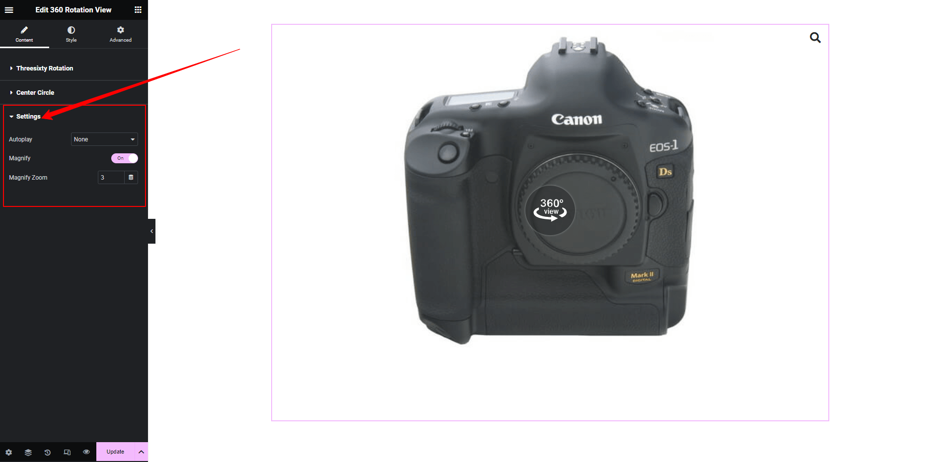
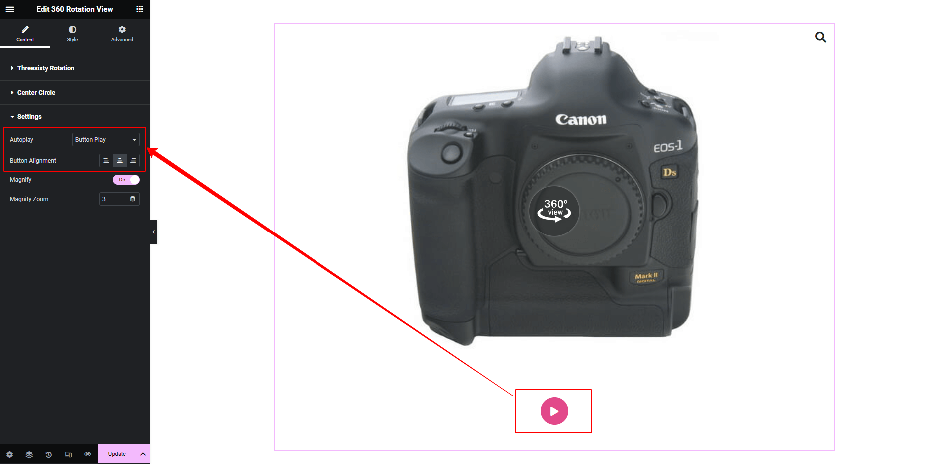
On the left sidebar in the content tab, you will find a setting option immediately after the image gallery option. From that option, you will be able to add an auto-rotation feature or a button which will help the users to see the image rotation by clicking on it.
If you select the button play option then there will be a button. And you can set the position within three stages.
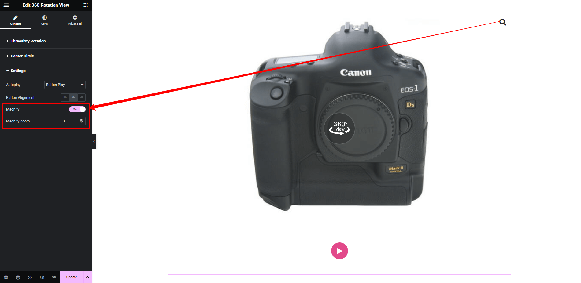
There is another feature to set zoom in / magnifying option for your images. You can enable it from this setting pannel. After activating that you will find a magnifying icon on your canvas. You can set the position for that icon as per your need. You can set the zoom-in amount from there, by increasing the number of Magnify Zoom settings.
Step Four:
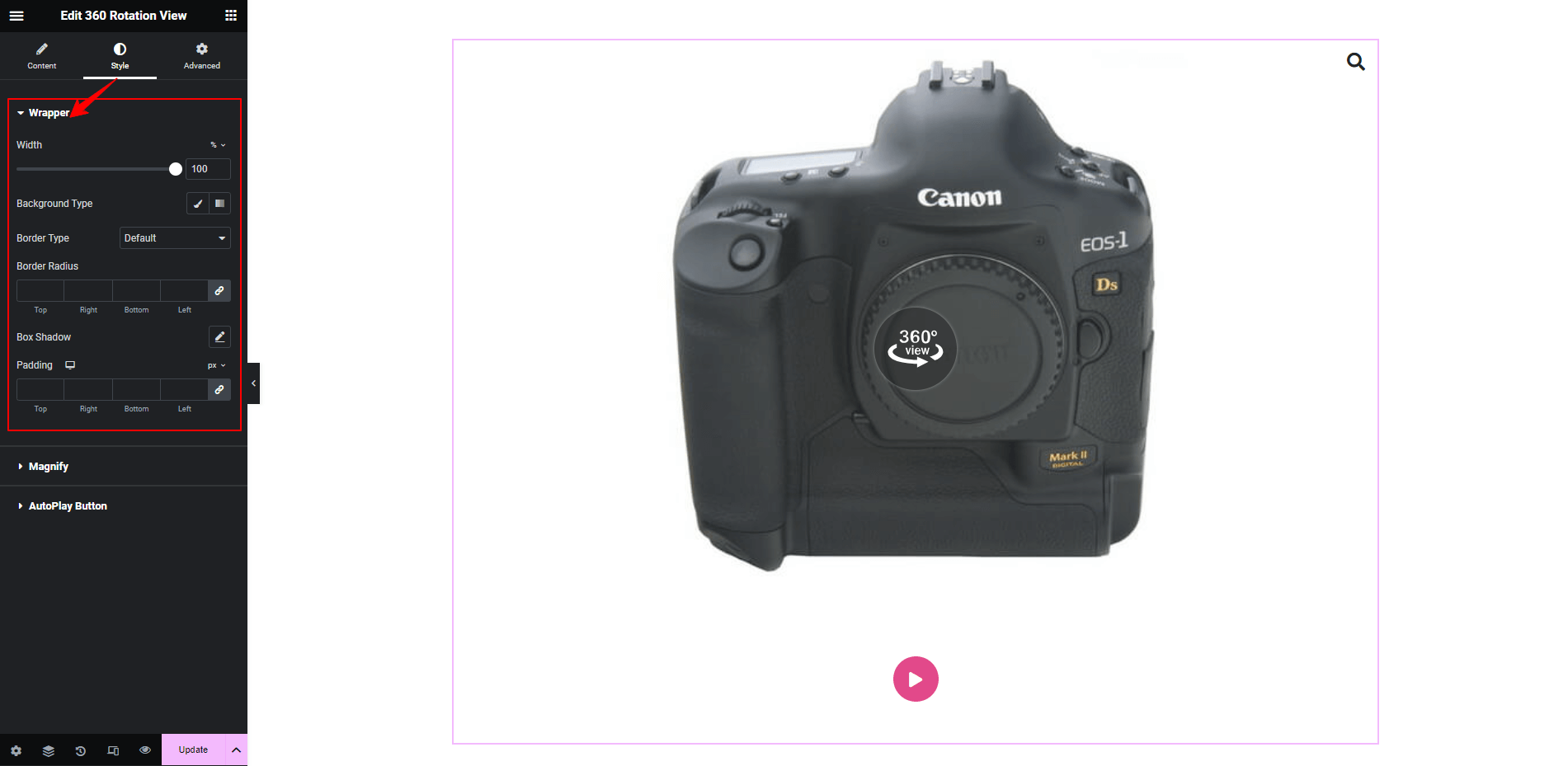
Here comes the styling section. On this style tab, you will find three types of styling functionality of Wrapper, Magnify, Autoplay Button.
Wrapper Styling:
Basically wrapper is the image container. You can customize the container as per your need. All sort of customization is available here. You can increase the wrapper size, flexibility to set border, background, shadow, padding, and much more. Fine-tune your design based on your demand.
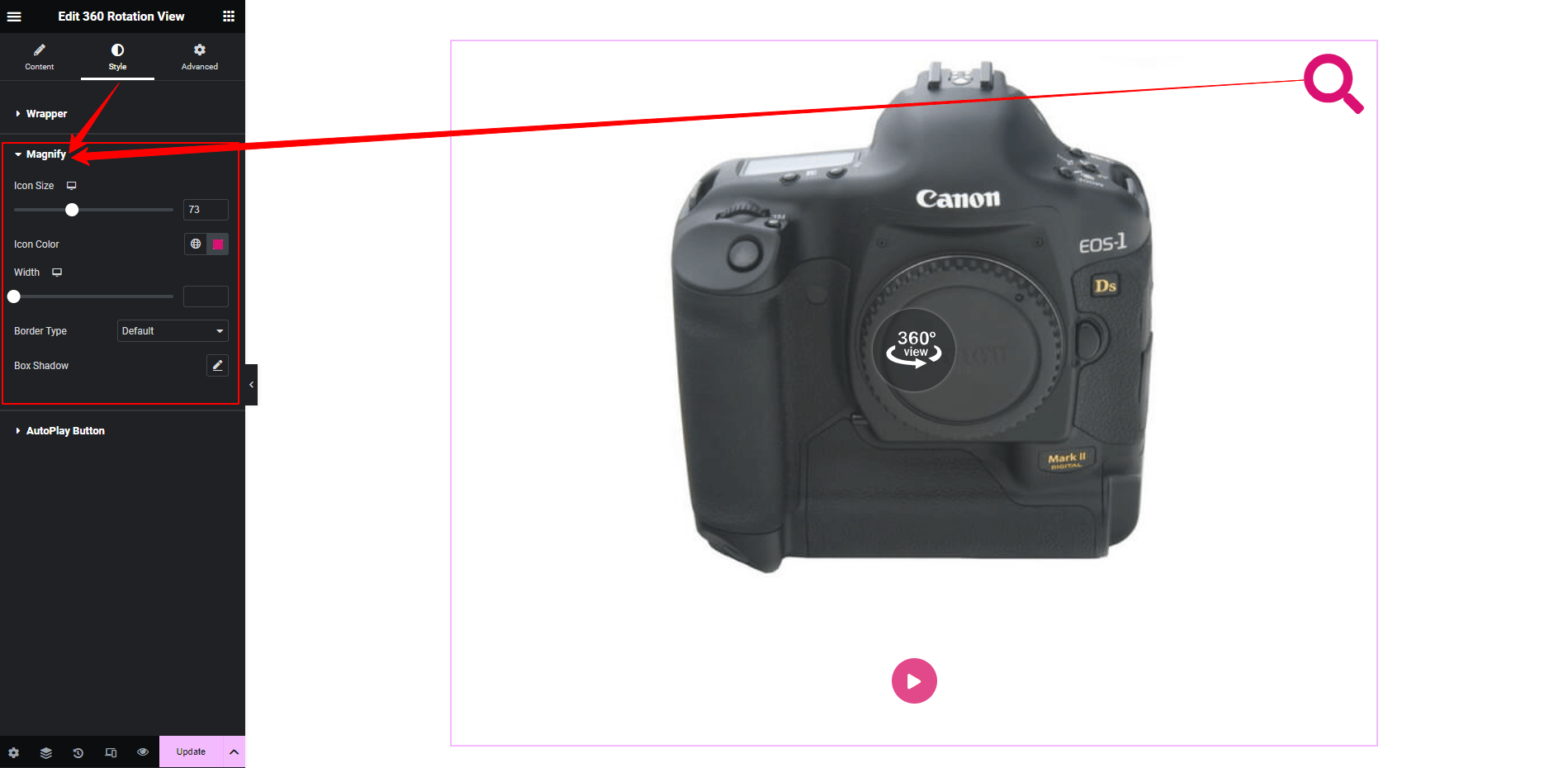
Magnify Button Styling:
You will get the freedom to style the default tone of the Magnify button. Increase the icon size, change color, give shadow, do your best.
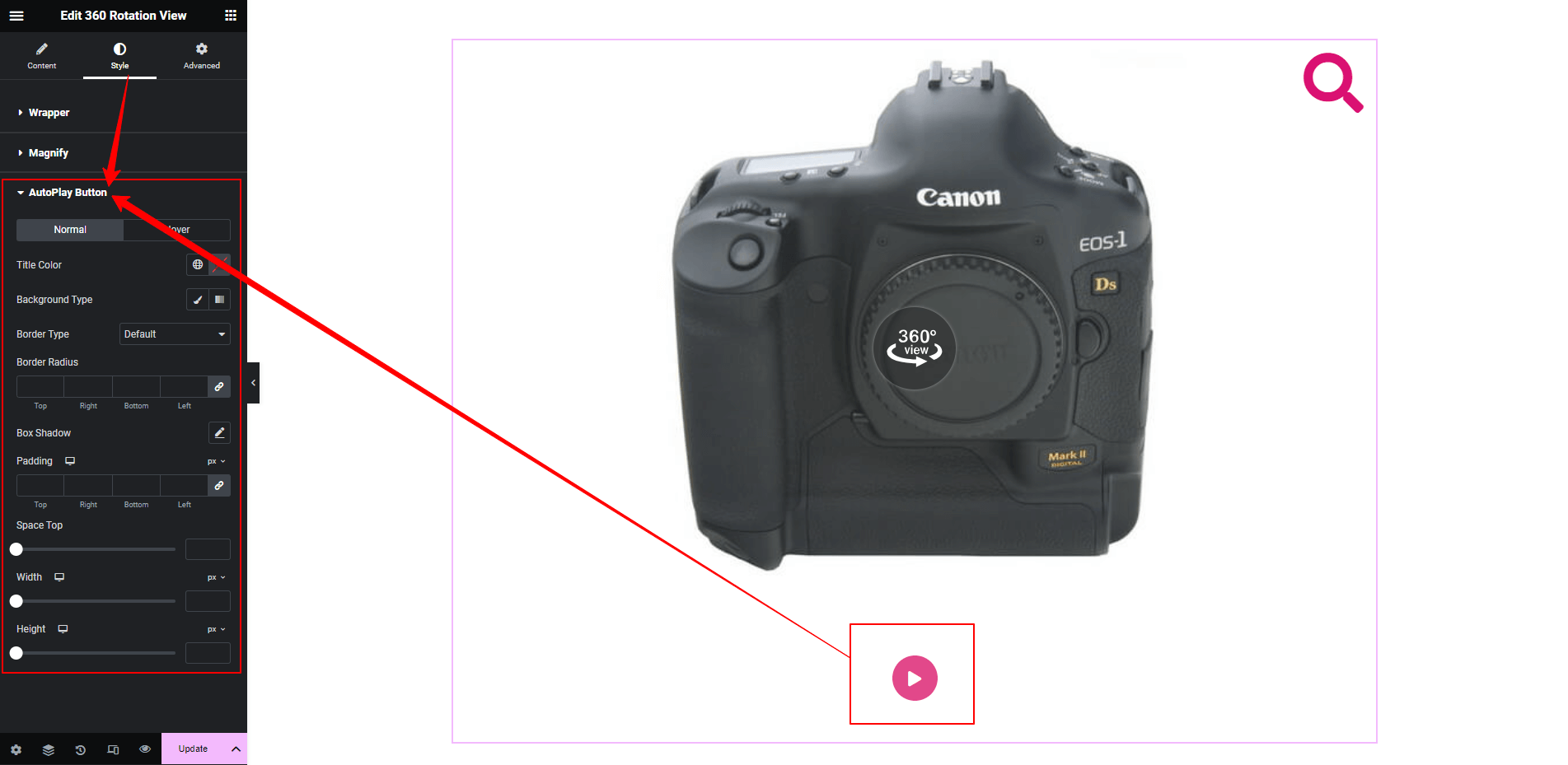
AutoPlay Button Styling:
In this section, you will have all kinds of options to design your button as per your design aesthetics. Set your style both in normal state and hover state. Set your own color tone, button size, padding, shadow, alignment, and also you can set distance between image and button.
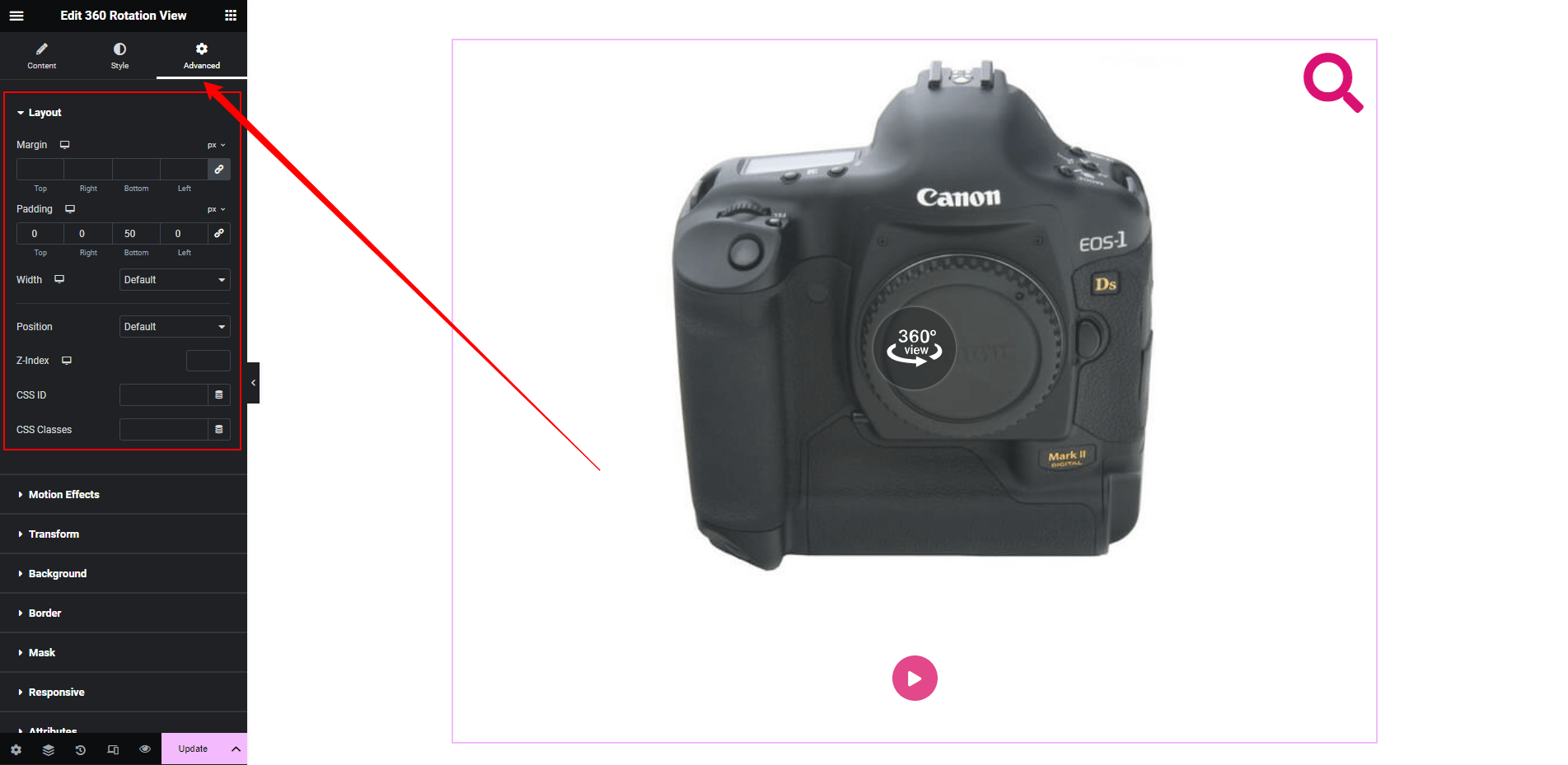
Step Five:
This widget also has the default advance tab features of Elementor widgets. Manage it as per your need.